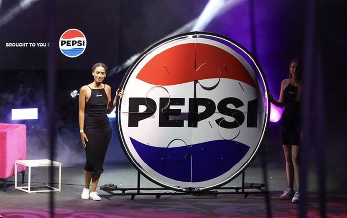
Pepsi unleashes new refreshed look after 14 years

Continuing its tradition of shaping cultural moments, Pepsi orchestrated a series of events to celebrate this occasion. In Johannesburg, a digital installation was undertaken to transform The Ponte Tower into a colossal Pepsi Can, while in Cape Town, spectators saw a virtual Pepsi can hovered over Cape Town Stadium, symbolically pouring Pepsi into the venue.
Additionally, Pepsi recently collaborated with 947, Anele and The Club to curate a live broadcast extravaganza at the prestigious Teatro Montecasino.
With a remarkable 14-year period since its last logo update, Pepsi continues to keep its fans thirsty for new experiences, for a better planet, for stronger partnerships, and for accelerated growth across the portfolio.
Not just a new logo
"This brand refresh transcends a simple logo update; it signifies the dawn of a new era for Pepsi," states Marius Vorster, marketing director – PepsiCo West, East, and Central Africa (WECA).
"Through the transformation of iconic landmarks and the creation of captivating virtual experiences, we are reaffirming our commitment to innovation, creativity, and fostering deep cultural connections.
"For 14 years, Pepsi has consistently satisfied consumers' thirst with the best-tasting cola. Today, we embark on a new journey, a new era with a promise of more immersive and entertaining experiences," adds Vorster.
Pieter Spies, CEO of The Beverage Company, adds, "Pepsi's exciting visual refresh isn't just a logo change, it's a powerful symbol of their ongoing commitment to innovation and cultural connection.
"We've been proud partners with Pepsi for years, sharing a passion for delivering exceptional taste and engaging experiences.
"This new identity reflects that shared vision, with a modern twist that resonates with today's consumers. We're thrilled to embark on this exciting journey with Pepsi and solidify their position as a beverage leader."
Undeniably Pepsi
The logo and visual identity thoughtfully borrow equity from its past and incorporate modern elements to create a look that is unapologetically current and undeniably Pepsi.
Key design elements include:
- The Pepsi globe and wordmark unite to fit into various settings and emphasise the distinctive Pepsi branding.
- An updated colour palette introduces electric blue and black to bring contrast, vibrancy, and a contemporary edge to the classic Pepsi colour scheme. Given the brand’s continued focus on Pepsi Zero Sugar the design brings in the colour black, further showing the brand’s commitment to Pepsi Zero Sugar in the future.
- A new visually distinct can silhouette, which heroes the iconic Pepsi can as an accessible brand for all.
- A modern, custom typeface reflects the brand’s confidence and unapologetic mindset.
- The signature Pepsi pulse evokes the “ripple, pop and fizz” of Pepsi-Cola with movement. It also brings the rhythm and energy of music, an essential and continuing part of the Pepsi legacy.
Related
2025 Warc Media 100 ranks top-performing global media campaigns 18 Mar 2025 5 Super Bowl commercials that deserve places in the advertising hall of shame 10 Feb 2025 Bevco launches ‘Route to Market Expansion Project’ 20 Jan 2025 How BevCo is tapping into SA’s township economy 12 Sep 2024 Battle of the beverages: Varun Beverages acquires BevCo, sets to expand African footprint 16 May 2024 Anele and The Club Live: A radio extravaganza proudly brought to you by Pepsi 28 Mar 2024


