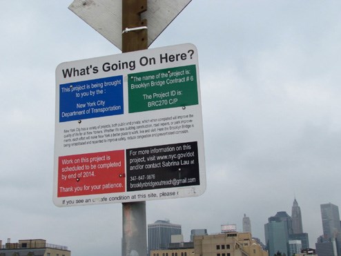
Brooklyn bridge information signboard
Beads on a necklace
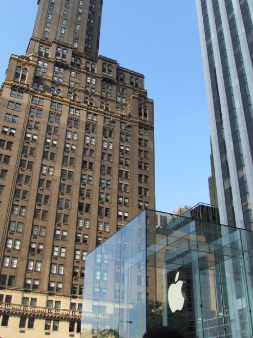
They don't call it the Big Apple for nothing, but far from being faceless and impersonal, NY actually feels quite intimate and welcoming, a far cry from what one might expect from the scale of its 90-odd square kilometre geography and super size architecture - green spaces, parks, courtyards, water features, urban furniture, drinking fountains and dog parks, mixed-use domestic, commercial, retail and utility spaces*, art, art and more art, ensure a walk in the city, consists of a series of bite-sized, inspiring moments strung together like a beads on a necklace.
Does my bum look big in this plaza?
One can't help but compare this with a small city like Cape Town's, vast expanses of underutilised space - outside the Artscape Theatre and Civic Centre complexes, the Cape Town station, the Grand Parade, the Foreshore, the Green Point Stadium and the CTICC piazzas - to name just a few, which do not yet offer any solutions to making a walk from one side to the other any safer, more aesthetic, engaging, enjoyable, inclusive, educational or diverse for any citizens (or their dogs) - yet as some of the human conduits of the city, are the very areas that offer the potential to do so.
Start at the heart and work out from there
Having been recently awarded the prestigious title of World Design Capital, Cape Town is feverishly debating what initiatives should be tabled in order to be fully worthy of the honour. Taking a lead from new York, I would offer the suggestion to start at the heart. The Grand Parade scene of so many landmark moments in the city's history, including Nelson Mandela's famous release speech, seems like the idealplace to start, The creation of a landmark destination, not just an expanse of paving, with every step of this area offering potential for wow moments - those beads on a necklace - could be just what we need.
Design that holds your hand
If we were for example to map out a route - say from the Artscape complex, across the Civic Centre plazas, through the railway station, via many architectural landmark buildings in the area to the highlight of the Grand Parade and City Hall by means of a signposted "pathway", ending at the Castle or the design hub of the Fringe, punctuated by relevant art, information boards, historical info, urban furniture etc we would be succeeding in the sort of bite-sizing of the city's most integral spaces.
This kind of design thinking is not just for the sake of adding aesthetic decoration or pattern, but for the sake of meeting the most basic of civic objectives - providing, by design, not by accident, places (outside of shopping malls) for people to meet, to eat, to play, to learn, to own, to converse, to remind us of our shared humanity - a city that holds your hand, that opens it heart.

Design for bite size spaces
Destination design
Similar thinking would give us the tools to revive our now largely defunct fan walks - with plaques and art commemorating the moments and heroes of 2010 World Cup, prolonging their value and legacy and maybe succeeding in becoming as much design destinations as our natural wonders - which I believe to be the essence of the reason for Cape Town being awarded World Design Capital status - to be a world design destination.

Destination architecture

Design for delight and diversity
Design diversity
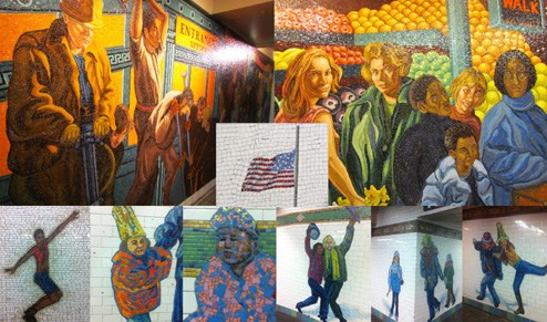
Public art in New York displays an almost obsessive need to depict diversity, revealing itself in the layers of its history - development, destruction, repurposing and reconstruction, with arguable degrees of success - but hey they do nothing but try. Visual motifs in public spaces unashamedly celebrate all forms of the arts, words, workers, builders, founders and immigrants equally without exclusion or favouritism. We can take cues from these initiatives, that public art should not avoid owning all aspects of its cultural heritage and reflecting them back at ourselves.
Why is civic design different from any other kind of design?
Civic design's purpose is to anticipate needs. Its vocabulary is the architecture, typography, signage, symbolism and motifs that communicate, even on a most subliminal level, that some designer somewhere cares about your experience, about how you are, who you are, where you are, why you are there, where you might want to go next.
Design where people are
Every available surface of New York's ±450 subway stations are tiled, most with exquisitely rendered mosaic work. It is heartwarming to think how many skilled artists must be employed in these endeavours. From New York we learn that starting with the thoroughfares - the places where people already are - walk routes, trains and train stations - is an effective way to communicate our best design intentions. Our train stations are probably the most under-designed in the world and yet they offer a blank canvas to promote the unique character and flavour of each suburb and its resident artists. This is what other world design capitals would do.
Inclusive design
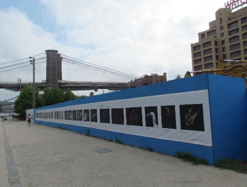
Historically "exclusive design" - malls, gates, privacy, security, defensiveness, no-place-to-loiter mentality are preclusive of world design capital status. Design thinking and techniques can even safely make environments more inclusive by using the barricades themselves as design showcases, reproducing artworks and art photography on vinyl or other substrates to wrap or secure new developments or renovations, thus turning exclusive inside galleries into inclusive outside ones and celebrating public art for all. In New York there is some sort of system, whereby the city negotiates the funding for these sort of public/private initiatives in return for the granting of certain terms of the development rights, so that all benefit.

Design for inclusion
Design that encourages a sense of ownership
As the intro to this article states, on one of my New York rambles, I am thrilled by a simple sign, that most people would probably not consider an ideal subject for a holiday snap. The Brooklyn Bridge authorities are inviting every kind of participation in their current upgrade, including contact names for further information, website details, phone and project numbers - the essence of INCLUSIVE design, allowing for dialogues and ownership from the city's most important stakeholders - the ones who live in it.
Maybe this is the greatest lesson from New York - no matter how unequal the geography of its suburbs may be, even while we sort out waste management and other mandatories of civic life, the heart of a great city belongs to everyone who lives in it and civic design if it does nothing else, must relentlessly and unequivocally hammer home a sense of ownership and belonging by design.
Good communication design is our most democratic tool.
The streets lead by example. Design solutions need not be grandiose. While we are mooting corridors that will bridge our suburbs, the sinking of railway lines or the repurposing of highways -- design that simply delights, empowers, reflects and says that we care would go some way to tiding us over. Some of the work being done by http://www.blackhat-nimbus.co.za/other_projects/myciti-station-art-woodstock for the new Myciti bus stations in Cape Town, is masterful and well thought out if a bit unemotional, but it's a start.
Design Education for all
In order to be able to get the greatest number of people meaningfully involved in the design debates that need to happen to take any city into the 21st century, it is essential that design knowledge not remain exclusive. The evolution of communication design is a great way of teaching world history in a politically neutral way and typography should be taught at schools as early as possible, lest our children grow up thinking that humans have been printing Comic Sans and Arial Bold off inkjet printers since the dawn of time.
The groundswell of support in America for their post-matric liberal arts courses is growing. If we can't compete in the sciences, we should at least play to our strengths to ensure our kids are globally competitive by collaborating on an educational syllabus that puts design centre stage.
The man on the street
To this end I am absolutely thrilled to have received notification of the inaugural Opendesign event. According to the press release, well-known creative activist and creative director for the event, Y Tsai, has stated its objectives as "a grass roots movement concerned with the ways in which design can engage directly with the man on the street... and a call to action for the design community to share their creative skills to help solve some of our most pressing social issues."
So exciting. See you there.
*This is what is missing from the District 6 redevelopment and I urge anyone with any influence to address this as soon as possible to avoid any further regrets.
